When replicating styles and technologies of cinematic generations past, there comes the question of stylistic authenticity versus newly realized potential. Is the goal to tell a story as it may have been told by the target generation's methods, or is it to adopt that older way of thinking and create a modern vision from vintage mentality? Perhaps Pages From a Virgin's Diary's goal isn't necessarily one or the other, but whatever its aim, it seems confused - lost somewhere between the two notions.
Certain in-camera or post production effects executed to attain the look of a 1920s silent film - slightly accelerated camera speed, choppy cuts and moments of over-exposure - are spot-on. Others, though, come across like a far sloppier, far lazier version of Mark Romanek's video for Nine Inch Nails' Closer. On top of a questionable use of extreme close-ups and overly frequent fades, filters are placed over shots creating obtrusive, computerized blur-halos or color screens a la Mighty Joe Young's climactic fire rescue. The artistic motivations behind this random, rapid-fire barrage? I can't begin to guess them.
Neither can I answer for the film's pace. Admittedly, much of the proceedings are well-conceived and impressive to behold, but each shot barrels past at such an unheard-of rate it's near impossible to appreciate it all without some serious pause button abuse. Combined with the fifty-three minute runtime, the fast pacing does at least make for an endurably brief experience.
So this movie... it's a ballet. Now, the few times I've been to live ballets, I've actually found myself enraptured by the beauty of dance's open-ended meanings. Here, however, the dancing stands to represent very little. There are exceptions, like most of what the charismatic Dracula himself puts on, but for the most part it's a mere kick 'n' wave show.
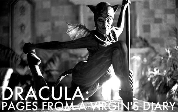
In attempt to be complimentary, it is interesting how Dracula here is made out to be sympathetic while Van Helsing is villainized. This is not a new concept, but a compelling one nevertheless. And those demonic-looking vampires? They were genuinely frightening. Oh, and those title cards - with textual scenario aids like "Manly temptation!" and "Cuckold's counterblow!" they seemed like Transylvanian versions of "Pow!" or "Zocko!" from the 1960s Batman series.
More than anything, though, Pages From a Virgin's Diary just made me want to revisit other, better takes on the Dracula tale from the Hammer Studios... or from the wacky minds of Andy Warhol and Paul Morrissey.


